I originally created this tutorial for a course I was TAing. It primarily goes over the basics of how to plot and fit simple things with Gnuplot. Most of the things here should work well with any reasonably recent version of Gnuplot, but no promises.
This tutorial supposes the existance of a (sparse) data file with a rough decaying exponential. The one I used can be found here. If you'd like to see the plots, click on any of the plot or replot commands.
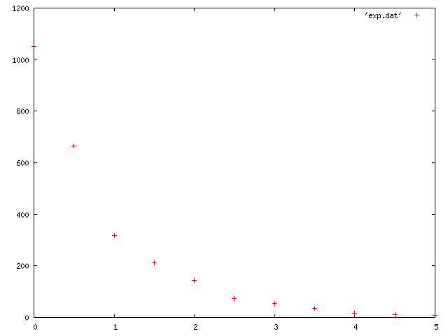
By default, when plotting a file, Gnuplot assumes the first column is your x value, and your second column is your y value. In other words, it assumes you mean this:
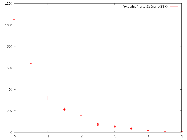
If you'd like to use any other columns for anything (like different data columns or errors), then you need to specify that. It is also useful to note that instead of using a particular column, you can perform mathematical functions on columns.
plot 'exp.dat' using 1:2:(sqrt($2)) with yerrorbars
Most gnuplot syntax can be abbreviated, which I do often. I will, however, spell out the entire syntax the first time I use something, but I won't comment on this again. For example, the above line can be shortened to:
plot 'exp.dat' u 1:2:(sqrt($2)) w yerr
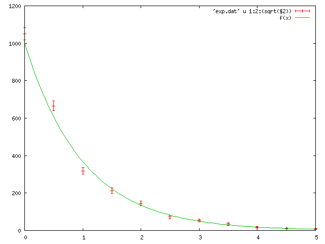
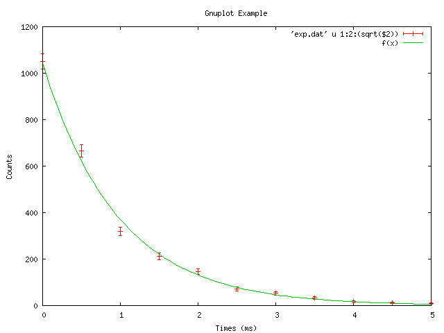
To fit data, you need to define the function to which you will be fitting the data, and provide a starting guess for any variables.
f(x) = A0*exp(-x/tau)
A0=1000;tau=1
plot 'exp.dat' u 1:2:(sqrt($2)) w yerr, f(x)
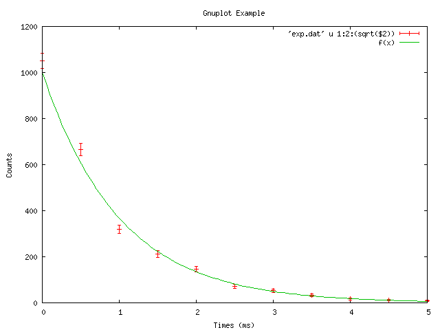
Now you should be able to see the raw data, and the guess fit. It's nice to improve the presentation though with some axis labels and maybe a title for the figure.
set title 'Gnuplot Example'
set ylabel 'Counts'
set xlabel 'Times (ms)'
replot
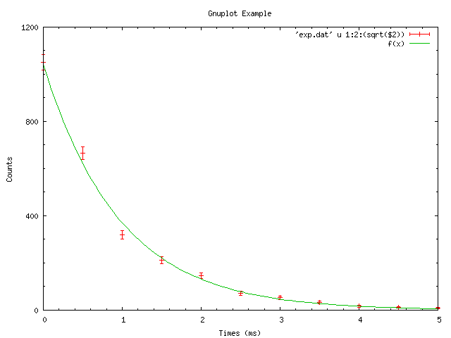
Now, to fit the data:
fit f(x) 'exp.dat' u 1:2 via A0, tau
plot 'exp.dat' u 1:2:(sqrt($2)) w yerr, f(x)
That's a reasonable fit of the data, but the fit isn't taking into account the errors. Adding that into the fit is done just the same was as adding it to the plot, whether you use the square root function like here or if you have that in a third data column.
A0 = 1000; tau = 1
fit f(x) 'exp.dat' using 1:2:(sqrt($2)) via A0, tau
plot 'exp.dat' u 1:2:(sqrt($2)) w yerr, f(x)
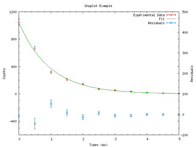
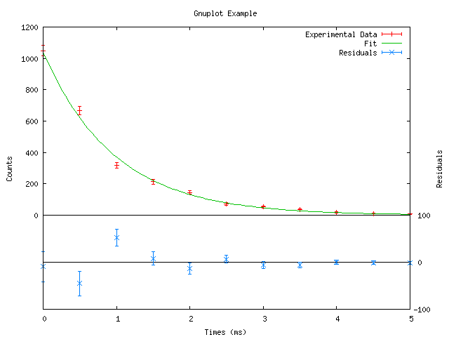
We can also customize the plot in a few ways:
set key top right
set ytics 400
set mytics 4
set mxtics 5
replot
If you do other things and forgot the values and don't want to scroll up, you can just type:
show variables
Now if you want to plot the residuals, there is actually another yaxis you can use: y2.
set y2label 'Residuals'
set yrange[-600:1200]
set y2range[-100:500]
set y2tics border
There's a lot of information there, but we can make it easier to read by adding some lines at y=0 and by really customizing the y-axis tics.
set xzeroaxis lt -1
set x2zeroaxis lt -1
set ytics (0,200,400,600,800,1000,1200)
set y2tics (-100,0,100)
set mxtics 1
replot
Finally, you may want to save your figure. There are many different filetypes that can be used. I find EPS works well for including in LaTeX.
set terminal postscript color portrait dashed enhanced 'Times-Roman'
set output 'file.eps'
set size 1,0.5
replot